Tuesday, 17 May 2011
Evaluative Response
I also went back to Chizom, who was the boy i interviewed on video to see what his thoughts on our finish product was.
Here is a script of the conversation:
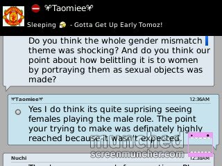
Me: So what was your overall opinion on the music video?
Chizom: I personally don’t like that type of music, but I think the music video was really good. The way the images cut to the beat looked slick and professional and I liked the idea of a manly role being played by girls, in order to get your initial point across.
Me: Oh so you noticed what we tried to do? Did you think it is effective?
Chizom: Yeah, it was because you didn’t like the way girls are usually being portrayed in music videos so you made them behave in the total opposite way for a shock factor. And yes it was quite shocking and unexpected.
Me: So what do you think we could have improved?
Chizom: I think the storyline could have been improved, because it wasn’t very clear what was going on or what the actual point was
Me: Oh okay, and what was your favourite aspect of the video?
Chizom: The fact that the whole music was in black and white was my favourite aspect because it gave the whole video an edgy, cool feel to it
Me: What did you think about the poster and digipak?
Chizom: I thought they were really good. I liked the fact that the message conveyed was also put into the advertising. From the image on the digipak, you wouldn't expect the video the girls to be acting as males, so it increases the shock factor, emphasising your point.
Me: Okay Thank you very much for your time :)
Here is a script of the conversation:
Me: So what was your overall opinion on the music video?
Chizom: I personally don’t like that type of music, but I think the music video was really good. The way the images cut to the beat looked slick and professional and I liked the idea of a manly role being played by girls, in order to get your initial point across.
Me: Oh so you noticed what we tried to do? Did you think it is effective?
Chizom: Yeah, it was because you didn’t like the way girls are usually being portrayed in music videos so you made them behave in the total opposite way for a shock factor. And yes it was quite shocking and unexpected.
Me: So what do you think we could have improved?
Chizom: I think the storyline could have been improved, because it wasn’t very clear what was going on or what the actual point was
Me: Oh okay, and what was your favourite aspect of the video?
Chizom: The fact that the whole music was in black and white was my favourite aspect because it gave the whole video an edgy, cool feel to it
Me: What did you think about the poster and digipak?
Chizom: I thought they were really good. I liked the fact that the message conveyed was also put into the advertising. From the image on the digipak, you wouldn't expect the video the girls to be acting as males, so it increases the shock factor, emphasising your point.
Me: Okay Thank you very much for your time :)
Monday, 9 May 2011
Audience feedback
With the increased Blackberry Messenger users and hype around this new instant messenging software for phones, I decided to use it to collect audience feedback. I broadcasted a link to our video on youtube to selected people from our target group and then asked them a series of questions. I selected one question and answer from each person. Here is what they had to say:


How effective is the combination of your main product and ancillary texts?
As seen before, this is our digipak:

And this is our poster:

I think our digipak and poster image is effective because it is striking and eye-catching. The pose looks quite seductive as only the lead singers lips are showing, which lures people in as ‘sex sells’. But when they watch the video they receive a shock as the girls in the video are in no way portrayed as sexual objects like they were expecting. This sends out our message that we don’t agree with the way women are treated in music videos and how we would like this to stop.
The fact it is in black and white is effective because darkness gives a sense of mystery and the audience are more wanting to find out more about it. Also because the majority of the lead singer’s face is covered, more mystery is caused and the audience are going to want to find out who the girl is. This would involve coming closer to read more about the poster or picking up the digipak case and browsing which is one step closer to actually buying or watching our video.
We decided to use the same image for the poster and digipak because we felt it would definitely be more effective. This is because the image would become iconic and so when the image is seen anywhere people can readily associate it back to who we are causing a greater awareness of our band and hopefully engaging more people to buy our media product.
This is similar to Joy Division’s album cover for ‘Unknown Pleasures’

It became so iconic that the image was used on other products other than the album cover and poster.

And finally, our digipak and poster our effective in the fact that the audience can grasp just from looking at it, that the music is of a punk-rock or similar genre. This is because we followed many of the conventions, such as not making so much emphasis on materialistic things or the band name and song. We did this by writing these details in small by the corner. We also had an image with a deeper meaning than just to show the artists face, which is typical of this genre. Even the title of the band ‘Genocide’ is obviously meant to have a deeper meaning, and so audiences will start thinking more and wondering what this is meant to represent. The mysterious, dark, black and white theme we chose also fits in with the punk rock genre, unlike genres like pop that have bright and colourful digipaks and posters.
Why did we choose to write the song words on our backs as a form of intertexuality?

Also in the film ‘Control’, it begins with the lead singer of the band walking down the street and we then see the word ‘hate’ written on his jacket. This represents the feelings that the singer had. In our video we decided to incorporate this but instead wrote the words of the song on our backs. This was in order to remind the audience of the song title and to get them thinking more, keeping their attention.
Why did we choose to have the whole video in black and white?
The most famous images of Joy Division were photographed by Anton Corbijn and are in black and white. This lead to the 2007 movie ‘Control’ (a film about the life of Ian Curtis- lead singer of Joy Division) to be shot all in black and white as this is the look they were well-known for.

Therefore we decided to also shoot our whole film in black and white as Joy Division fans or those who know about them will be able to relate our music video to Joy Division, which is what we wanted to do as we still wanted to represent the Joy Division band.


Therefore we decided to also shoot our whole film in black and white as Joy Division fans or those who know about them will be able to relate our music video to Joy Division, which is what we wanted to do as we still wanted to represent the Joy Division band.

Subscribe to:
Comments (Atom)
