Tuesday, 17 May 2011
Evaluative Response
I also went back to Chizom, who was the boy i interviewed on video to see what his thoughts on our finish product was.
Here is a script of the conversation:
Me: So what was your overall opinion on the music video?
Chizom: I personally don’t like that type of music, but I think the music video was really good. The way the images cut to the beat looked slick and professional and I liked the idea of a manly role being played by girls, in order to get your initial point across.
Me: Oh so you noticed what we tried to do? Did you think it is effective?
Chizom: Yeah, it was because you didn’t like the way girls are usually being portrayed in music videos so you made them behave in the total opposite way for a shock factor. And yes it was quite shocking and unexpected.
Me: So what do you think we could have improved?
Chizom: I think the storyline could have been improved, because it wasn’t very clear what was going on or what the actual point was
Me: Oh okay, and what was your favourite aspect of the video?
Chizom: The fact that the whole music was in black and white was my favourite aspect because it gave the whole video an edgy, cool feel to it
Me: What did you think about the poster and digipak?
Chizom: I thought they were really good. I liked the fact that the message conveyed was also put into the advertising. From the image on the digipak, you wouldn't expect the video the girls to be acting as males, so it increases the shock factor, emphasising your point.
Me: Okay Thank you very much for your time :)
Monday, 9 May 2011
Audience feedback
With the increased Blackberry Messenger users and hype around this new instant messenging software for phones, I decided to use it to collect audience feedback. I broadcasted a link to our video on youtube to selected people from our target group and then asked them a series of questions. I selected one question and answer from each person. Here is what they had to say:


How effective is the combination of your main product and ancillary texts?
As seen before, this is our digipak:

And this is our poster:

I think our digipak and poster image is effective because it is striking and eye-catching. The pose looks quite seductive as only the lead singers lips are showing, which lures people in as ‘sex sells’. But when they watch the video they receive a shock as the girls in the video are in no way portrayed as sexual objects like they were expecting. This sends out our message that we don’t agree with the way women are treated in music videos and how we would like this to stop.
The fact it is in black and white is effective because darkness gives a sense of mystery and the audience are more wanting to find out more about it. Also because the majority of the lead singer’s face is covered, more mystery is caused and the audience are going to want to find out who the girl is. This would involve coming closer to read more about the poster or picking up the digipak case and browsing which is one step closer to actually buying or watching our video.
We decided to use the same image for the poster and digipak because we felt it would definitely be more effective. This is because the image would become iconic and so when the image is seen anywhere people can readily associate it back to who we are causing a greater awareness of our band and hopefully engaging more people to buy our media product.
This is similar to Joy Division’s album cover for ‘Unknown Pleasures’

It became so iconic that the image was used on other products other than the album cover and poster.

And finally, our digipak and poster our effective in the fact that the audience can grasp just from looking at it, that the music is of a punk-rock or similar genre. This is because we followed many of the conventions, such as not making so much emphasis on materialistic things or the band name and song. We did this by writing these details in small by the corner. We also had an image with a deeper meaning than just to show the artists face, which is typical of this genre. Even the title of the band ‘Genocide’ is obviously meant to have a deeper meaning, and so audiences will start thinking more and wondering what this is meant to represent. The mysterious, dark, black and white theme we chose also fits in with the punk rock genre, unlike genres like pop that have bright and colourful digipaks and posters.
Why did we choose to write the song words on our backs as a form of intertexuality?

Also in the film ‘Control’, it begins with the lead singer of the band walking down the street and we then see the word ‘hate’ written on his jacket. This represents the feelings that the singer had. In our video we decided to incorporate this but instead wrote the words of the song on our backs. This was in order to remind the audience of the song title and to get them thinking more, keeping their attention.
Why did we choose to have the whole video in black and white?
The most famous images of Joy Division were photographed by Anton Corbijn and are in black and white. This lead to the 2007 movie ‘Control’ (a film about the life of Ian Curtis- lead singer of Joy Division) to be shot all in black and white as this is the look they were well-known for.

Therefore we decided to also shoot our whole film in black and white as Joy Division fans or those who know about them will be able to relate our music video to Joy Division, which is what we wanted to do as we still wanted to represent the Joy Division band.


Therefore we decided to also shoot our whole film in black and white as Joy Division fans or those who know about them will be able to relate our music video to Joy Division, which is what we wanted to do as we still wanted to represent the Joy Division band.

Why did we choose to have a gang made of females?
We researched into other music videos and a lot of music videos that only contained males usually had a sense of violence or was gang related. Our favourite video was ‘Justice- Stress’.

This video contained a gang of boys who were quite antisocial. They all had the same clothes on which represented that they were in the same gang. And handheld, interesting shots were used a lot. We loved this idea and incorporated in our music video, using girls instead of boys which is shocking to the audience as girls are usually shown as sexual props and so hopefully let the audience understand that we disapprove of that and our video was a form of mockery in order to rebel against the way women are treated. We also used handheld, interesting shots to give the video and edgy feel similar to the ‘Stress’ video and we all wore the same clothes to represent members of the same “gang”.

This video contained a gang of boys who were quite antisocial. They all had the same clothes on which represented that they were in the same gang. And handheld, interesting shots were used a lot. We loved this idea and incorporated in our music video, using girls instead of boys which is shocking to the audience as girls are usually shown as sexual props and so hopefully let the audience understand that we disapprove of that and our video was a form of mockery in order to rebel against the way women are treated. We also used handheld, interesting shots to give the video and edgy feel similar to the ‘Stress’ video and we all wore the same clothes to represent members of the same “gang”.
Sunday, 8 May 2011
Target Audience in depth interview
In order to find out more information of what our target audience thought about music video's in general and their specific ideas on the way women are represented, I interviewed a member of this target group.
To conclude, I feel like this age group and gender don't really feel like it bothers them much the way women are represented. As a male himself, he enjoys women to be in music videos and doesn't think deeper into what the females think about this topic. He knows it isn't fair but didn't necessarily think about that before the interview. So hopefully, once our music video is showed to him, he will have a changed opinion and understand what we are trying to say.
To conclude, I feel like this age group and gender don't really feel like it bothers them much the way women are represented. As a male himself, he enjoys women to be in music videos and doesn't think deeper into what the females think about this topic. He knows it isn't fair but didn't necessarily think about that before the interview. So hopefully, once our music video is showed to him, he will have a changed opinion and understand what we are trying to say.
Finished Digipak
Due to the research I undertook, I came to the conclusion that artists of the ‘rock’ and sub rock genres (punk rock artists) usually have a deeper meaning to their posters and adverts whereas genres such as r’n’b and pop usually make the purpose of their adverts to glamorise themselves and other materialistic objects. For this reason we made our finished digipak like this:

We have put the lead singer’s face in big on the cover. This is because we wanted to emphasise the fact that it is a female which is contradictory because she is lip syncing a man’s voice, in an attempt to portray herself as a male. We kept it in black and white in order to fit in with Joy Divisions classic look and also to represent a hidden message, as dark colours are seen as mysterious. Normally when a female is showing nothing but her lips, it is meant to represent seduction as the lips are famous for being sensuous. However, when the audience actually buy or watch the final product, they will pleasantly be surprised to find that this isn’t the case and for once females are not actually being portrayed as sexual objects so the shock will be greater. We used the font ‘Courier new’ and used capital letters. This is because ‘courier new’ looks like a formal font to let the audience know that there is a sense of seriousness with our song, and not just made for fun, which is emphasised with the capital letters.

The inside of the digipak has got a crumpled up school tie and shirt. This is because we also wanted to represent the loss of innocence, and how troublesome teenagers are at this day and age. Uniform usually represents rules and because everyone looks the same when wearing it unison is also represented. Therefore crumpling up the uniform and leaving it on a brick wall symbolises how teenagers don’t care about rules and regulation and just simply don’t follow them. Also it shows that they all want to be different.

This the back cover. The empty swing compliments the message that the inside is trying to state about the loss of innocence. Younger people are seemed to enjoy playgrounds. However since the swing is empty can symbolise that they don’t do these things anymore. Empty swings can also represent desertedness, which is linked to the front cover’s message as we want the gender stereotypes to be wiped out as in a genocide leaving that area of music videos deserted.
Digipak 3: Nirvana- Never Mind
Nirvana is an American rock band that was most popular in the late 90’s. This album cover is following the stereotypical ‘rock’ genre as one of the conventions are that the faces of the members of a rock band are not usually shown on their album covers. They are more likely to show a controversial image, or an image that represents a certain idea that they believe in.
This album cover shows a baby floating in water and trying to grab money. This is basically stating the loss of innocence. That as soon as the baby is born everything is about money. Another connotation could be that the baby represents life and seeing as he is trying to get money means that life revolves around getting money. During fishing, living things are used as bait to draw the fish in. Sometimes they are thrown back in but the majority of the time they are hurt. The money in this image is attached to the fishing line as bait, and it suggests that we as humans will be reeled in to anything to do with money as we are all money hungry, but attached to the money is usually something negative.

This album cover shows a baby floating in water and trying to grab money. This is basically stating the loss of innocence. That as soon as the baby is born everything is about money. Another connotation could be that the baby represents life and seeing as he is trying to get money means that life revolves around getting money. During fishing, living things are used as bait to draw the fish in. Sometimes they are thrown back in but the majority of the time they are hurt. The money in this image is attached to the fishing line as bait, and it suggests that we as humans will be reeled in to anything to do with money as we are all money hungry, but attached to the money is usually something negative.

Digipak 2: Curtis Mayfield- There’s no place like America today

Curtis Mayfield was an American soul/funk singer in the mid-late ‘60’s. He is well-known for his politically conscience style of music and this digipak is a prime example of this. The title of the album is called ‘There’s no place like America today’ which is slightly ironic. The digipak consists of a billboard in America stating that America was the best place anyone could live in with a land of opportunities for everyone. The billboard picture has a perfect white family with fancy clothes, a car and they are all happy. However in reality, standing right in front of this billboard, we see a queue of black people with solemn expressions, tatty clothes and holding loads of items as if they are homeless. This is basically stating that America were hypocrites, because they claimed to be this wonderful place but in actual fact the only people who were experiencing America in this light were the upper-class white people, so Mayfield was basically stating that racism still existed although it was made out like it wasn’t and there was still a hierarchy of race in society, in which white people where above black people.
The billboard is printed in a lot of colour whereas the black people queuing up in reality, also the buildings in the background are all dull looking. Colour draws attention and therefore the emphasis is put on the billboard, this highlights to the audience even more what Mayfield is trying to represent and it also connotes a clearer contrast and division between white and black people. The fact that the white people are in colour shows that white people have happier lives in America as colour usually shows joy and the fact that the black people look cramped and are dull looking represents that that is how they live, in cramped conditions due to the small houses they can afford and their dull lives as they are not happy.
Digipak research
In order to get a better perspective of digipaks so that we can understand better how to prepare our own, I have researched and analysed different existing digipaks.
Digipak 1: Katy Perry- Teenage dream
Katy Perry produces pop music, which should have the following conventions of young, fun and happy upbeat music. This Album cover in fact presents these features and is therefore representing the pop genre. This is done by her use of baby pinks and blues which are associated with youth and young children. The actual CD is actually printed in a candy red and white spiral which again represents youth as it is similar to that of sweets, as is the giant candy floss looking cloud that she is laying on. Also her name is written in a balloon like font which again is very playful and fun.
The album title is teenage dream and this has been used as the theme for the Digipak. The fact she is laying on a cloud connotes the fact she is in a dream as does the red and white spiral of the CD. As well as looking like a piece of candy, it also looks similar to that of a hypnotist’s tool for making people sleep, which again is a visual image of the album title. The images inside the Digipak are of the artist dressed up as a prom queen wearing a tiara and a prom king wearing a crown. Going to the prom is culturally one of the biggest events that happen in a typical American teenage girl’s life. The narrative of the album cover can therefore be suggesting that a teenage girl’s dream is to go to the prom and become the queen.
The fact she is naked could suggest that she is trying to compare to that of a new born baby which represents herself as young and playful, as a child is. Young age is definitely represented in this cover due to the candy like feel of the colours used, the candy floss/cloud background, the candy looking CD and the images of the prom queen and king. Young people are stereotyped to love sweets and having fun. Going to the prom is also a major stereotype of teenagers and therefore the target audience of teenagers and younger children is highly reached.
Women usually try to dress and look young and babyish in order to attract men as there instinct is to protect women and their family. This is why a lot of woman buy teddy bears and sit on men’s laps as a baby would. Katy Perry’s album could give this different meaning and target men instead of young teenagers, due to the fact the album cover is young and fresh. Also the fact she is naked could give a sexual impression and so older people, especially men would become the target audience.

Our band name
Females in music videos are usually looked at as sexual objects, in which they have no role except for to arouse males and are treated as props. On the other hand, males are portrayed as the dominant person and are referred to as trouble makers, drinkers and smokers. In a feminist way of removing the representation of women in music videos, we decided to switch roles as a form of mockery. This is how we came up with the band name ‘Gendercide’. Genocide is defined as the deliberate destruction of an ethnic, racial, religious, or national group. So our play on this word means the deliberate destruction of stereotypical gender roles.
Wednesday, 4 May 2011
Music Video Organisation
Story Outline
We have chosen to make our music video to Joy Division's song, 'No Love Lost'
Due to the research we have done, we have concluded that our music video will be about portraying the life’s of youth today in the form of 3 young girls, using the punk rock conventions and still trying to resemble Joy Divison as a band. This will involve going through the day in the life of these girls, causing havoc, drinking, smoking and enjoying themselves the way youth are stereotypically made to do.
Actors
The people that will play the 3 girls will be the following:
Amy

Me (Nuchi)

Marwo

Choosing members of the group to do the acting, instead of others, was our choice so that time management and getting hold of each other for filming would be a more manageable task.
Possible Locations
We wanted to use places that looked urban, youthful and that fitted in to the punk rock theme. Here are some of the possible locations:
Camden Town Camden Town would be a great location because a lot of young people who are typical members of the punk sub-culture are present here. It is also well known for a place that more eccentric people like to visit and so will fit in with our video.
Alleyway
This alleyway has graffiti and wired fences which resembles something of troublesome teenagers and prison, which is typical of the punk rock genre.
Wembley Park As we are however still trying to resemble ourselves to the sophisticated side that joy division have, we wanted to take similar poses to the Anton Corborjin photos of the band. And with the buildings and tourists attractions, Wembley is a good place for it.
Playground Playgrounds are usually associated with young innocence that children have, therefore us shooting here will be juxtaposing this idea and connote how the innocence of childhood is lost these days.
Costumes
Joy Division wears smart/casual clothes. Therefore in order to represent this we also want to have a similar look.
We have decided on wearing Blazers, with worker boots in order to give us a more masculine look, similar to the band.
We have also decided that we are going to paint the words of the song on to our backs for intertextuality, and to remind the viewers about the song their listening to.

Props
We want to make use of props that will let viewers know they are watching a punk-rock music video.
This is going to include:
• Cigarettes
• Alcohol
• Instruments (guitar and microphone)
As these are conventional props of this genre
We have chosen to make our music video to Joy Division's song, 'No Love Lost'
Due to the research we have done, we have concluded that our music video will be about portraying the life’s of youth today in the form of 3 young girls, using the punk rock conventions and still trying to resemble Joy Divison as a band. This will involve going through the day in the life of these girls, causing havoc, drinking, smoking and enjoying themselves the way youth are stereotypically made to do.
Actors
The people that will play the 3 girls will be the following:
Amy

Me (Nuchi)

Marwo

Choosing members of the group to do the acting, instead of others, was our choice so that time management and getting hold of each other for filming would be a more manageable task.
Possible Locations
We wanted to use places that looked urban, youthful and that fitted in to the punk rock theme. Here are some of the possible locations:
Camden Town

Alleyway
This alleyway has graffiti and wired fences which resembles something of troublesome teenagers and prison, which is typical of the punk rock genre.
Wembley Park

Playground
Costumes
Joy Division wears smart/casual clothes. Therefore in order to represent this we also want to have a similar look.
We have decided on wearing Blazers, with worker boots in order to give us a more masculine look, similar to the band.
We have also decided that we are going to paint the words of the song on to our backs for intertextuality, and to remind the viewers about the song their listening to.

Props
We want to make use of props that will let viewers know they are watching a punk-rock music video.
This is going to include:
• Cigarettes
• Alcohol
• Instruments (guitar and microphone)
As these are conventional props of this genre
Tuesday, 3 May 2011
Oasis wonder wall
With us deciding my group deciding on a black and white concept for the video , found this video particularly interesting to make reference to with this video also being black and ,which the way that they were able incorporated different ideas such as making the instruments the focal point and making the instruments the only things throughout the video I thought it was interesting and though we may not particular follow this idea I thought that what we could take from this video is the fact that we need the video to b exciting to make up fore black and white concept and also with our song choice the instrumental part plays a very big part on the song so I thought it would be a great idea for us to high light that in out video
Eve - Let Me Blow Ya Mind found on R&B
Eve - let me blow ya mind
In this video with the concept and narrative basically consisting of the female artist acting rebellious and contradicting stereotypes of how a woman should actually act ,I thought this video would be good to make reference to when we are planning our ideas and filming the actual video
Oasis supersonic
For the instrumental part I thought this would be a good idea as the instruments in this video seem to be a focal point and exaggerated as such, I thought it would just help generally with different ideas and inspire different ways that the video could be made to stand out to similar videos in the genre
Saturday, 16 April 2011
Audience Research
In order to find out who our target audience was, I conducted a questionnaire to 3 different age groups: Under 18’s (Teenagers), 18-25 (Young Adults), 25+ (Adults). Here are the results of how the questionnaire went.
After collecting this data we came to the conclusion that our target audience will be Under 18's. Here is the reason why:
After collecting this data we came to the conclusion that our target audience will be Under 18's. Here is the reason why:
Questionnaire results presentation
View more presentations from nuchi_.
Friday, 15 April 2011
EVALUATION: Question 4
Question 4:
How did you use media technologies in the construction and research, planning and evaluation stages?
How did you use media technologies in the construction and research, planning and evaluation stages?
Question 4
View more presentations from nivea001.
EVALUATION: Question 2
Question 2:
How effective is the combination of your main product and ancillary texts?
Part 1:
Part 2:
How effective is the combination of your main product and ancillary texts?
Part 1:
Part 2:
EVALUATION: Question 1
Question 1:
In what ways does your media product use, develop or challenge forms and conventions of real media products?
In what ways does your media product use, develop or challenge forms and conventions of real media products?
Eval question 1
View more presentations from nivea001.
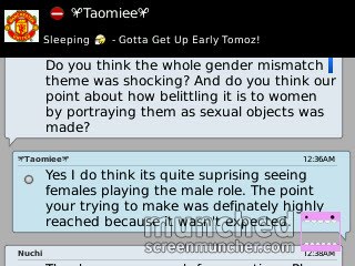
Audience feedback
This is the feedback I gained from my orignal participant who I interviewed about what they wanted to see. I have returned to her after making the video to show her the finished product and tell me if she thinks I've made a product which she would want to see.
Finished Music Video
This is the finished product of our music video. We posted it on YouTube so that it can be seen by anyone else interested. We may receive useful feedback from using a site like YouTube. It can be found at the address below:
Finished Poster
This is the finished poster product:

I followed the conventions of posters promoting albums and I used the same image from the album which I'm trying to promote, on my poster. This causes instant recognition from my target audience and from the people listening to my music and creates an image which is stuck in their minds and which they will always associate with the band. It also creates recognition to the album so that when the poster is up in someone's room, they may feel like they want to listen to the music by constantly being in the presence of the image. Additionally, unlike the digipak, the poster has both the name of the band and the name of the album which helps with the recognition, So that the name will always remind people of the band, and again causing instant recognition.

I followed the conventions of posters promoting albums and I used the same image from the album which I'm trying to promote, on my poster. This causes instant recognition from my target audience and from the people listening to my music and creates an image which is stuck in their minds and which they will always associate with the band. It also creates recognition to the album so that when the poster is up in someone's room, they may feel like they want to listen to the music by constantly being in the presence of the image. Additionally, unlike the digipak, the poster has both the name of the band and the name of the album which helps with the recognition, So that the name will always remind people of the band, and again causing instant recognition.
Poster Research
Aswell as the digipak, I also have to create an advert for the promotion of the music video. So I thought it would be useful to just have a look into the conventions real life bands use when making adverts to promote their albums.


Advertising posters are the simplest yet most effective way to promote an album. Bands tend to literally just take the image from the front cover of the album, add reviews and a date of when the album is out. This helps to familiarise people with the image and to eventually become so used to it that they will instantly make the connection between a song by the band and that image on a poster and perhaps buy the CD.


Advertising posters are the simplest yet most effective way to promote an album. Bands tend to literally just take the image from the front cover of the album, add reviews and a date of when the album is out. This helps to familiarise people with the image and to eventually become so used to it that they will instantly make the connection between a song by the band and that image on a poster and perhaps buy the CD.
Finished Digipak
As well as making a video, we also had to create a Digipak to explore the idea of how we would go about promoting the music video. After doing my own research into the conventions of digipak's I eventually came to a conclusion about what it should look like. The genre of our music usually have controversial, meaningful and personal CD covers (just like the Clash and Nirvana), so I took this on board and came up with this Digipak...
This is the front cover of the digipak:

I chose this design because it fits in with our bands theme of gender mismatching. Again, like the video, it highlights the way that 'Gendercide' play with the way that different gender's are represented. Obviously the real band who sings this song is Joy Division and Ian Curtis was the main singer. So the voice is a males voice in the song but by having a girl miming along it plays on the idea of gender separation which brings you to the name 'Gendercide' essentially abolishing all social gender roles. The digipak cover enhances this as not only is the image simply an interesting one, it's also simple enough for the audience to interpret themselves as the angle of the face and the deep contrasts and shadows doesn't make it clear about whether the person is a male or female.
The font used for the writing was 'Courier new' as it made for an effective and serious font which takes the audience in to the intent and resolute nature of the music that 'Gendercide' make.
This is the left inside picture which is seen behind the first CD:

This is the right inside picture which is seen behind the second CD:

The two inside sleeves are of a school shirt and tie crumpled up and left on a brick wall. I thought this would be interesting as it's not too important to our image so it's almost like a bonus image when opening up the digipak, and because it sent out a vague message which leaves people free to either interpret it or just enjoy it as an image when they've taken the CD out.
This is the back cover of the digipak:

I used this image for the back cover because it was a simple image taken directly from the video. As it's black and white it keeps with the whole consistency of the video and compliments the front cover instead of over shadowing it.
Further digipak research
I've looked into front covers of digipaks for research and so I wanted to look at what's found inside a digipak and on the back before I make it so that I know exactly what I'm doing.
This picture shows what the inside of a typical digipak looks like;

As you can see it seems like the convention to have an image behind the CD's in a digipak to make the whole thing more interesting. It just adds a little more to the whole image of the digipak as it seems to me that it would be disappointing and inconsistent if there was an interesting image on the front and an interesting image on the back, then just blank sides on the inside.
I will be using this is in my own digipak.
This is the back cover of a typical digipak;

It's very common on thew back of digipaks to have a very simple image so that it doesnt over shadow the front image. Though it still needs to be a good image which keeps in tone with the rest of the image of the digipak. Additionally this research reminded me of the essential logo's at the back of the digipakto add to it authenticity.
I will take this influence and use it for my own digipak.
Thursday, 14 April 2011
One to one interview
For further and more in depth audience research, I interviewed someone outside of college who was in the age range of our target audience and who listened to the kind of music we're promoting.
I uploaded the interview onto YouTube and it's in sections for time saving purposes.
Interview part 1:
Interview part 2:
Interview part 3:
Interview part 4:
I uploaded the interview onto YouTube and it's in sections for time saving purposes.
Interview part 1:
Interview part 2:
Interview part 3:
Interview part 4:
Tuesday, 12 April 2011
Storyboard
Storyboard 2
View more presentations from Stunnah.
This is the storyboard we followed for our production. However its not to perfection because we did a bit more extra filming after this and we did not keep it in the same order when we edited.
Magazine Research


To where most punk bands played live gigs and concerts in the 70's and 80's the magazines adverts only advertised their live performances unlike today where nearly all magazine adverts advertise CD's and digipacks but rarely gigs. However now that the internet has become a fast way of consuming people download illegal which causes problems for the artist/band. in order to resolve this issue more and more band/artists are starting to play in gigs.
Evaluation: Question 2
How effective is the combination of your main product and ancillary texts?
The combination of our main product and ancillary is effective. We did an extra bit of filming trying to recreate Anton Corbijn’s still images of “Joy Division” when we discovered that one shots at the beginning of the music video of the lead singer Amy would be an excellent choice on the front cover of both the digipacks and magazine advert. This is because it represents our genre of music as a whole and our target audience can instantly recognise it.
The inside of the digipacks is an image of a wall going through the two insides and a uniform scrunched up on the corner. This was an idea that developed from the main product. Amy in one of the performance shot is sitting on a wall and so we thought we would use that them.
Then we thought about our target audience who are essentially people that like to view this music video as escapism, so we added the uniform as if to say someone took it off and went about their business. Uniform is seen as a way of keeping a form of equality and hiding individuality. So by taking it and scrunching it up on the side is a way to show our negative views on it. On the back of the digipack we are going to also take another print screen from our main product. So if the audience/consumers look at the back or front of the digipack they will spot the combination between the two.
Evaluation: Question 4
How did you use new media technologies in the construction and research, planning and evaluation stages?
The use of media technologies was important when constructing research, planning and evaluation stages of this project. After agreeing on our song choice and creating a rough idea of what we wanted to do in our media music video it was necessary to look into this further so we could get a broader vision in aspects of the codes and conventions in post punk genres. This lead to an in depth research of successful band “Joy division” and others in post punk genre for example “Sex Pistols” and “Ramones”. The secondary researching we did meant that we had easy access to the internet and allowed me to do analyse existing music videos from YouTube.
YouTube is where I could find exactly what aspects of real music videos I think worked to incorporate related ideas into my own work in order to make it successful and repeatable music video. Like most websites YouTube let me pause at particular shot so I can print screen it. I then used all the print screens for evidence on my blog to show feedback from Facebook and similar codes and conventions (see slideshow presentation of Question 3 on evaluation). I did this so my work would look more interesting visually. I also used the biggest search engine on the web Goggle. Google was useful in secondary research such as information about the artists, sound track and genre. But also researching real magazine adverts for digipacks and CD’s. Looking at other artists work helped me promote my music video and digipack by picking up on certain aspects and technique.
As a group we sat and discussed which location would work best with the form and conventions of our music video. We then took location shots to post on the blog such as the bedroom scenes. We took these images with a still camera (SLR) then connected it to the computer and uploaded them on to the blog.Whilst filming for some shots we used a tripod to keep the filming steady, however most of the time we filmed in handheld and point of view shots (POV) to create the engagement with the audience. We also used the steady-cam to create the disorientated spacey feeling at times e.g. Marwo answering the phone call.
Overall we used numerous media technologies in order to complete the project. All our work was presented on a blog so it was all technology bases. This experience on blogging gave me the opportunity to explore other creative ways of presenting my work other than essay based both visually and different formats.
Monday, 11 April 2011
Analysis of interview and questionnaire
The overall results I received from the interview and questionnaires I carried out is that my target audience watch music videos. The questionnaire results showed that the target audience watch music videos on Youtube. However the majority of them said they find out new realises of music videos and songs from friends through social networking websites.
Most of them said that they would like to see performance shots and would like the music video to contain some sort of narrative.
Interview 1: Mudan
Me: What is your name and your age?
Mudan: My name is Mudan and I’m 20.
Me: Ok, what type of music do you listen to Mudan and why?
Mudan: I listen to different types of music but my preferred genre is R&B, artists like Usher, Rihanna, Chris Brown etc. Ummm I listen to them because I believe they have talent, their lyrics is something I can relate to, mostly about relationships and what happens in everyday life. Ummm I think the rhythms and beats is “crazyyyyy” but also “catchy”.
Me: I like them too lol, but getting back to the interview... umm do you like watching their music videos and if yes what do you like about them?
Mudan: definitely, because the music videos tell a story. Like Rihanna’s new song “what’s my name” with drake, his sexy. They act out how they met and fell in love and show intense passion scenes. I like watching it because it’s happened to me and they give me hope even though it doesn’t always work out in the same way as the video.
Me: Yea ok, so do you think all things you just described such as relating to the music videos could apply to other genres such as post-punk rock?
Mudan: Well, it’s not something I listen to but I’ve seen one music video by the Clash, my friend showed it to me I wasn’t really listening to the lyrics because I was dancing to the beat lol. I was like, jumping in the air and acting like I had a guitar like rock bands do. The song as like, crazy but don’t remember the name.
Me: post-punk rock is not rock, but moving on lol... would you buy CD’s or prefer to download?
Mudan: Hahahah, I saw this question coming, I prefer to download illegally but there are one or two CD’s I brought so I can listen to it in my car and I do like all the bonus tracks. And their like, umm they are more reliable as well I suppose.
Me: Alright, thanks for you time
Mudan: Anytime man!
Performance shot
As a group we had decided to make the music video black and white, yet we shot most of the performance scenes in the “greenroom”. We did this because we hoped to make it seem like our lead singer Amy lip sinking to Ian Curtis’ voice could be placed in front of a brick wall. If we kept the performance scene in colour or made it black and white either way we wanted them to be different to the narrative shots. So instead of having the performance shots in colour we made it stand out by making the frames small than the wide frames for the narrative shots.
Narrative shots are in wide frames

Greenroom peformance shots

Narrative shots are in wide frames

Greenroom peformance shots

Gender Repersentation issues
• Women acting as men
For our music video decided to promote “Joy Division” and their song “No Love Lost”. The band members are all male which is ironic because the name “Joy Division” is a camp created for the Nazi soldiers (men) to rape Jewish women and use them as sex slaves. The band taking on such name in a way was a voice for the Jewish women that were less fortunate. However it’s somewhat giving men power; men created the camp which was negative power and men are also singing about the situation which is positive power. So as a group we had decided to play with gender roles and power we used women to enact the band that were essentially men. By doing this we had hoped to equalize the different genders and say “women can do everything a man can do”.


• Challenging representation of gender: costume, smoking, drinking and deviance We had researched the band’s costume and live performance to copy their persona because they hardly made music videos they usually played at gigs and concerts. Research in to the genre also helped build the persona, hence the band being controversy at their time. We had recreated what would have been seen as controversy in the 80’s to suite our time period. The time difference showed how the gender roles have changed tremendously over the years. We show women smoking, drinking, stealing beers and acting deviant. The narratives of rebellious behaviour lead to naming our album deviance.

• New band name “genderside” genocide With all the gender roles being switched we had felt that “Genderside” would be a suitable name for our band. We had taken the name from “Genocide” which originated in the 1948 from the holocaust a violent crime committed against groups with the intent to destroy the existence of the group, these were Hitler’s intentions. By playing on the word “Genocide”, we got gender the theme we are exploring throughout the music video then added “side” to the end of it to say one side of one gender is the other.

Subscribe to:
Comments (Atom)
